
Okay, let’s talk about the Fed dot plot. I know, I know – it sounds incredibly dull. But here’s the thing: it’s actually a surprisingly useful tool for understanding where the Federal Reserve thinks interest rates are headed. And that, my friends, directly impacts everything from your mortgage rates to the return on your savings account. So, stick with me, and we’ll break it down in plain English. What fascinates me is how something so seemingly technical can have such a tangible effect on our daily lives. It’s not just about some numbers on a chart; it’s about the future cost of borrowing and the overall health of the economy.
None
What Exactly IS the Fed Dot Plot, Anyway?
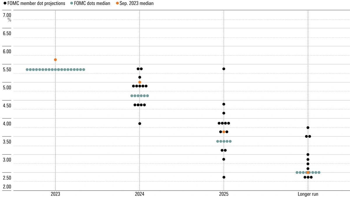
Think of the dot plot as a visual representation of the Federal Open Market Committee’s (FOMC) individual projections for the future path of the federal funds rate. The FOMC meets about eight times a year, and each member submits their anonymous ‘dot’ showing where they think the federal funds rate will be at the end of each of the next few years, plus a longer-run projection. The resulting scatter plot, or ‘dot plot’, gives the public a sense of the range of views within the Fed. It’s important to remember it’s a projection , not a promise. I initially thought this was straightforward, but then I realized that many people think it is a promise, which it is not. The federal funds rate influences the costs banks charge each other for overnight lending, which then trickles down to other interest rates.
Why Should You Even Care About These Dots?
Here’s why this matters to you, the average person in the United States. The dot plot offers clues about the Fed’s thinking on future interest rate hikes or cuts. Higher rates generally mean higher borrowing costs for consumers and businesses. This can impact everything from mortgage rates and credit card interest rates to the cost of business loans, which can influence hiring and investment decisions. If the dots are trending upwards, expect to pay more to borrow money. If they’re trending downwards, you might see some relief. But, and this is a big ‘but,’ the dot plot is just one piece of the puzzle. It is a signal that must be paired with the PCE inflation report and other data.
Reading Between the Dots | Interpreting the Fed’s Message
So, how do you actually interpret this thing? First, look at the median dot for each year. The median represents the midpoint of the projections, giving you a general sense of where the committee as a whole leans. Also, pay attention to the range of the dots. A wide range suggests greater uncertainty or disagreement among FOMC members. A tight cluster suggests more consensus. I’ve noticed that when the economy is particularly uncertain, the dots tend to be more scattered. This makes sense, as individual members may have dramatically differing opinions on future economic growth and inflation outlook .
The Dot Plot vs. Reality | A Grain of Salt is Required
Here’s a crucial point: the dot plot is not a crystal ball. It’s a snapshot of individual opinions at a particular moment in time. Economic conditions can change rapidly, and the Fed’s views can evolve accordingly. What fascinates me is how often these projections get revised. According to an article from the Brookings Institute (Brookings Institute) , economic forecasting is never an exact science. Therefore, it’s essential to take the dot plot with a grain of salt and not treat it as a definitive prediction. As per the previous analysis of economic projections , all forecasts should be taken as guidance, not gospel.
The Implications for Investors and Consumers
The federal funds rate projections influence market expectations, which in turn affect asset prices and borrowing costs. For investors, a hawkish dot plot (suggesting higher rates) might signal a time to be more cautious about riskier assets. For consumers, it could mean preparing for higher interest rates on loans and mortgages. A dovish dot plot (suggesting lower rates) could have the opposite effect, potentially boosting asset prices and lowering borrowing costs. The key is to stay informed, understand the trends, and adjust your financial strategies accordingly.
FAQ | Decoding the Dot Plot
What happens if the Fed’s projections are wrong?
Well, they often are! The Fed adjusts its course based on new data. Don’t treat the dot plot as a guarantee.
Does the dot plot directly affect my mortgage rate?
Indirectly. It influences broader market expectations about interest rates, which in turn impact mortgage rates.
Is the dot plot the only thing the Fed considers?
Absolutely not. The Fed also looks at inflation data, employment numbers, and global economic conditions.
Where can I find the latest dot plot?
It’s released after each FOMC meeting and can be found on the Federal Reserve Board’s website.
So, there you have it – the Fed dot plot demystified. It’s not as intimidating as it looks, and it can be a valuable tool for understanding the Fed’s thinking and preparing for the future. Remember, it’s just one piece of the puzzle, but it’s a piece worth paying attention to. I hope this gives you a deeper understanding of interest rate projections.